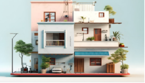

Colors have a powerful impact on our emotions, energy levels, and overall well-being. In Vastu Shastra, colors are not just decorative elements—they play a crucial role in balancing the five natural elements and enhancing positive energy within a space. Choosing the right colors for each room can help boost harmony, prosperity, health, and peace in your home or workplace.
This article explains ideal Vastu color choices for every room, along with what colors to avoid and why.
Why Colors Matter in Vastu Shastra
According to Vastu Shastra, every direction is governed by a specific element and planetary influence. Colors help strengthen or weaken these energies. When the right colors are used in the right spaces, they promote balance, while wrong color choices may lead to stress, conflicts, or stagnation.
Vastu colors aim to:
-
Improve mental and emotional well-being
-
Enhance prosperity and opportunities
-
Support physical health
-
Create peaceful and harmonious living spaces
Vastu Colors for the Living Room
Best Directions: North, East, or North-East
Recommended Colors
-
White
-
Cream
-
Light beige
-
Light green
-
Pastel blue
These colors create a welcoming and calm atmosphere and encourage positive social interactions.
Colors to Avoid
-
Dark red
-
Black
-
Dark grey
Heavy colors may make the space feel closed and restrictive.
Vastu Colors for the Bedroom
Best Direction: South-West
Recommended Colors
-
Light brown
-
Beige
-
Peach
-
Pastel pink
-
Soft blue
These shades promote relaxation, emotional balance, and restful sleep.
Colors to Avoid
-
Bright red
-
Dark purple
-
Jet black
Overly intense colors can disturb sleep and increase stress.
Vastu Colors for the Kitchen
Best Direction: South-East (Fire element)
Recommended Colors
-
Red (in moderation)
-
Orange
-
Yellow
-
Light brown
These colors strengthen the fire element and support energy and digestion.
Colors to Avoid
-
Black
-
Dark blue
These shades conflict with the fire element and may create imbalance.
Vastu Colors for the Dining Room
Recommended Colors
-
Cream
-
Light yellow
-
Peach
-
Soft green
These colors stimulate appetite and encourage pleasant family interactions.
Colors to Avoid
-
Dark grey
-
Black
Vastu Colors for the Bathroom and Toilet
Best Direction: West or North-West
Recommended Colors
-
White
-
Light grey
-
Soft blue
These colors maintain cleanliness and freshness.
Colors to Avoid
-
Red
-
Orange
-
Dark brown
Strong colors may increase negative energy in wet areas.
Vastu Colors for the Pooja or Meditation Room
Best Direction: North-East
Recommended Colors
-
White
-
Light yellow
-
Cream
-
Light blue
These shades promote peace, purity, and spiritual focus.
Colors to Avoid
-
Dark or flashy colors
Vastu Colors for the Study Room
Best Direction: East or North
Recommended Colors
-
Light green
-
Light blue
-
Cream
-
Off-white
These colors improve concentration, memory, and mental clarity.
Colors to Avoid
-
Dark red
-
Black
Vastu Colors for Children’s Room
Recommended Colors
-
Light green
-
Sky blue
-
Pastel yellow
These shades support creativity, growth, and positivity.
Colors to Avoid
-
Dark grey
-
Black
-
Very bright red
Vastu Colors for the Home Office
Best Direction: North or East
Recommended Colors
-
Light green (growth and progress)
-
White (clarity)
-
Light blue (calm decision-making)
These colors support productivity and financial growth.
Vastu Colors for the Main Entrance
Recommended Colors
-
White
-
Cream
-
Light brown
-
Soft yellow
A well-colored entrance attracts positive energy and opportunities.
Common Color-Related Vastu Mistakes
-
Using very dark colors in small spaces
-
Mixing too many bold shades
-
Ignoring direction-based color principles
-
Using black excessively
Balance and simplicity are key in Vastu color selection.
Tips for Applying Vastu Colors in Modern Homes
-
Use light shades if repainting is not possible
-
Add color through curtains, cushions, or décor
-
Avoid clutter to enhance color effects
-
Maintain natural light
Final Thoughts
Choosing the right Vastu colors for each room helps align your living space with natural energies. Even small color adjustments can create noticeable improvements in mood, harmony, and prosperity.
Vastu does not demand perfection—only awareness and balance. When applied thoughtfully, Vastu colors can transform your home into a peaceful and supportive environment.